
Slow Lane Brewing
Brand Identity & Packaging
Role – Creative Direction,
Design & Animation.
Studio –
Ben In Motion

Slow & Steady…
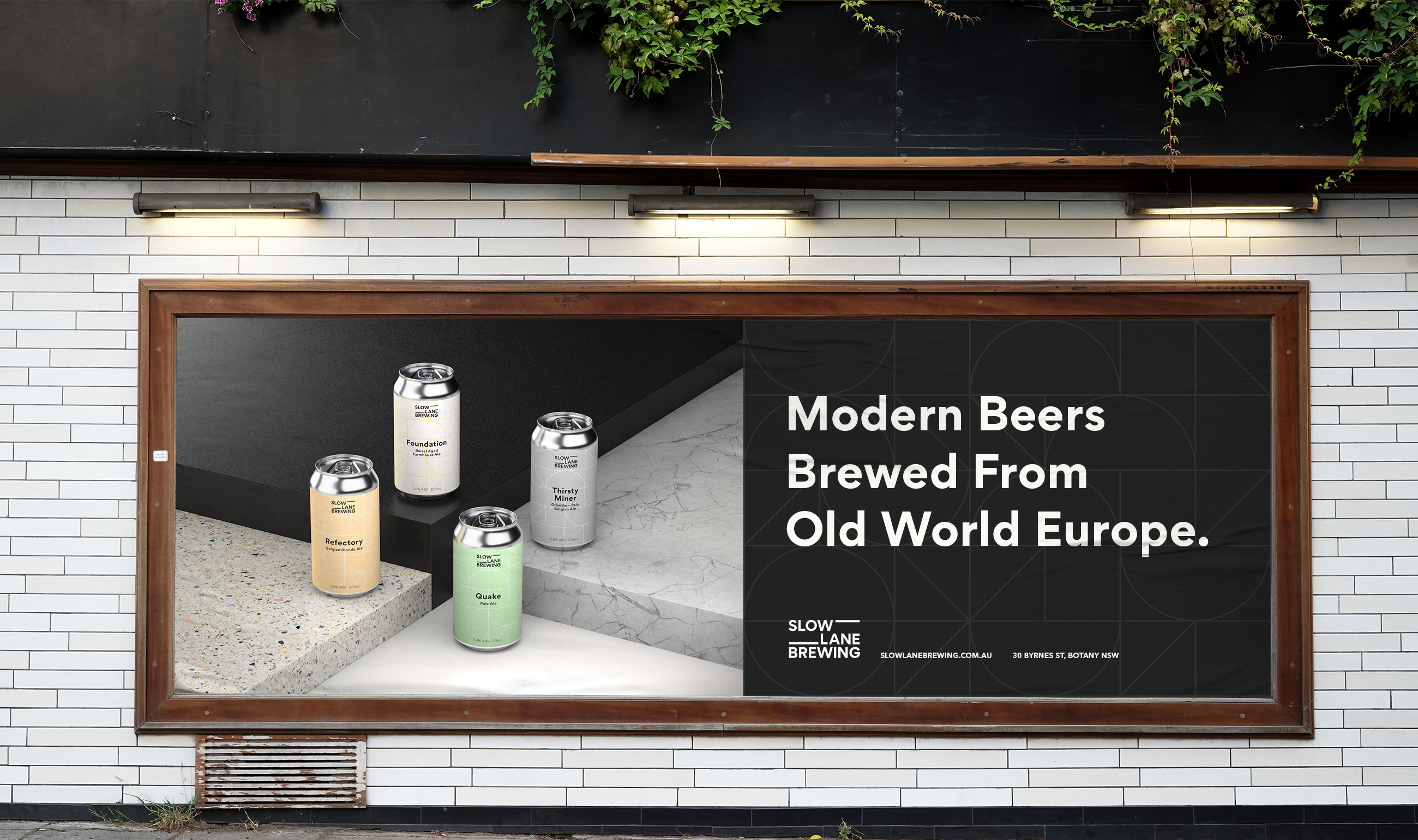
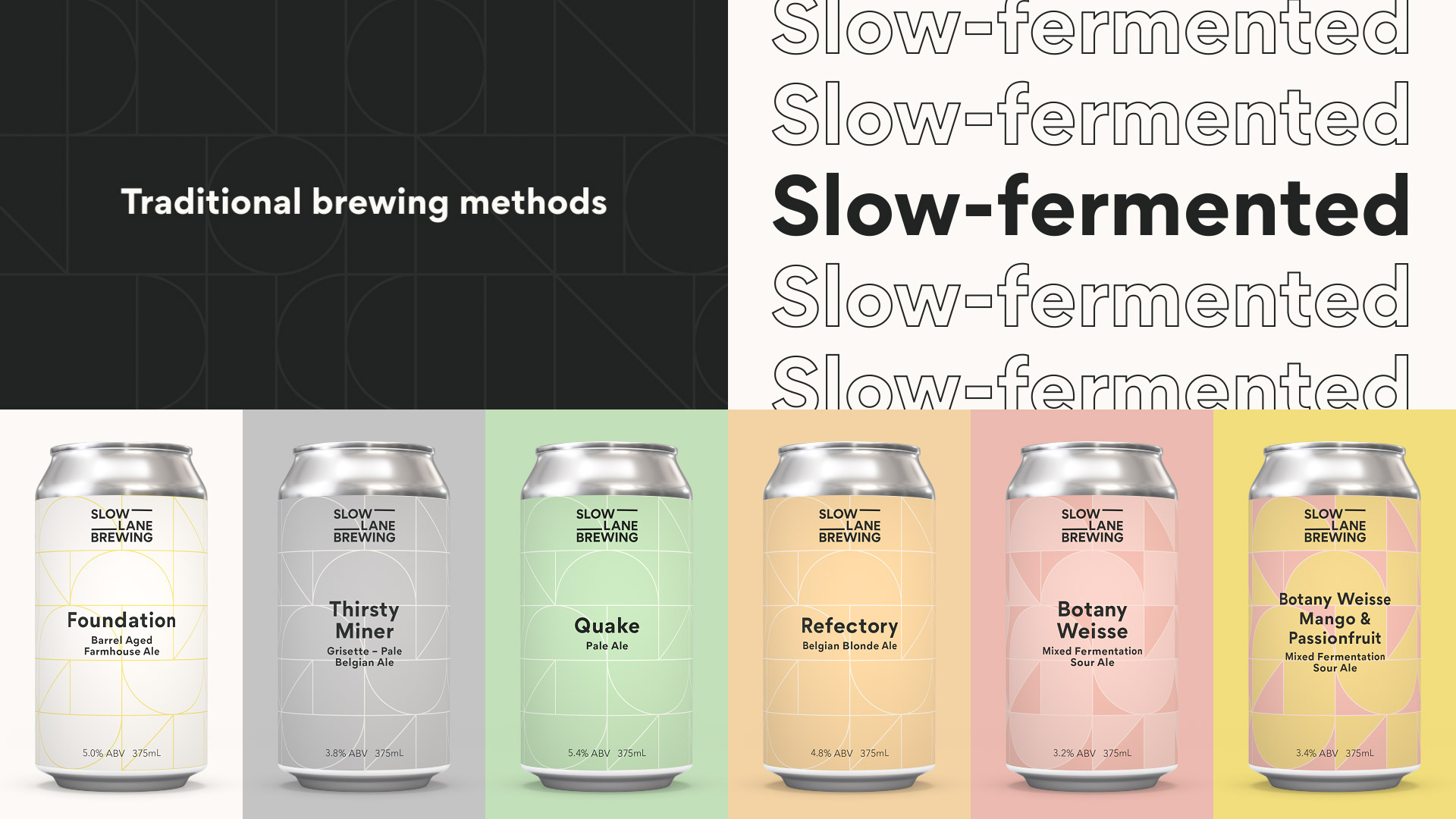
Slow Lane Brewing is a family owned brewery that uses traditional brewing methods to produce slow-fermented beer. They can and keg condition beers with a focus on more labor intensive processes that most modern breweries tend to abandon. Because they are doing things a little differently they wanted the brand to stand out amongst the indie beer scene with a bold, modern and minimal approach.
The goal was to build a master brand with a strong system that felt cohesive and grounded, yet flexible and vibrant for constant new releases of beer.
The goal was to build a master brand with a strong system that felt cohesive and grounded, yet flexible and vibrant for constant new releases of beer.


Branding System
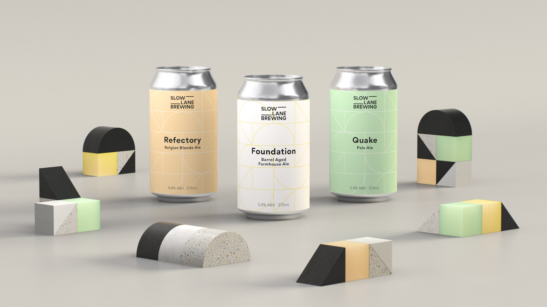
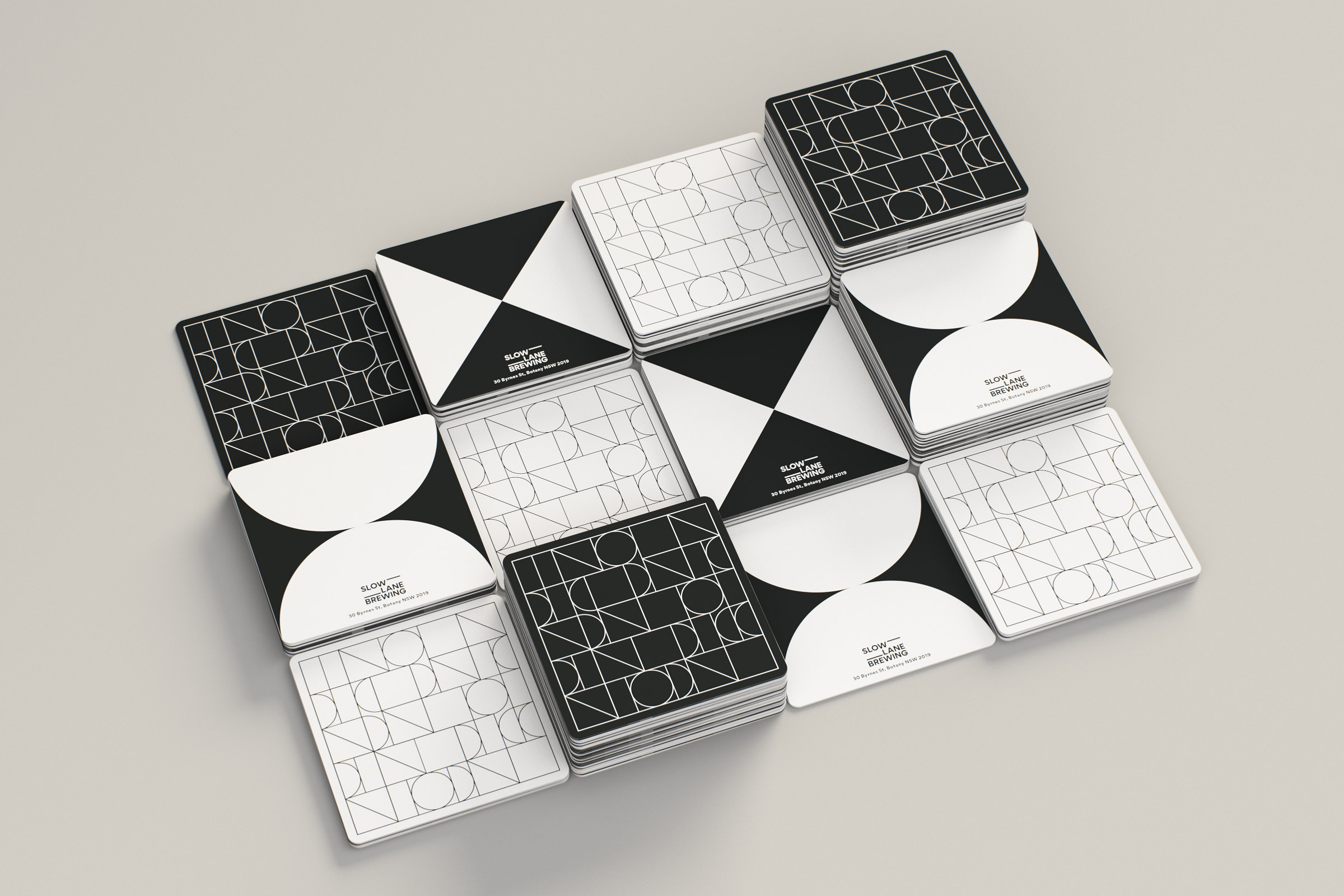
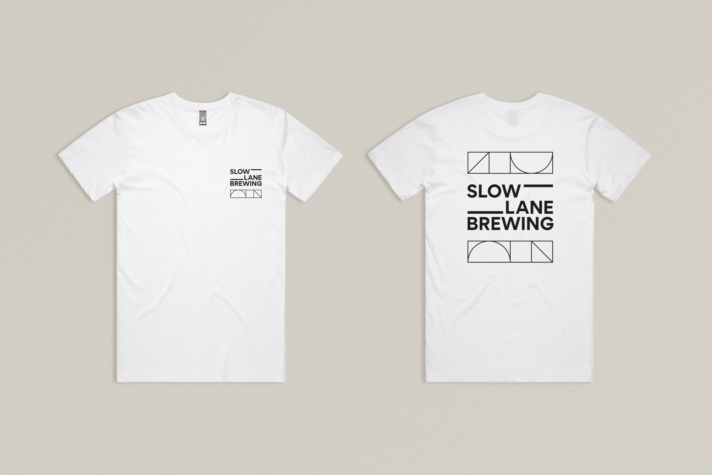
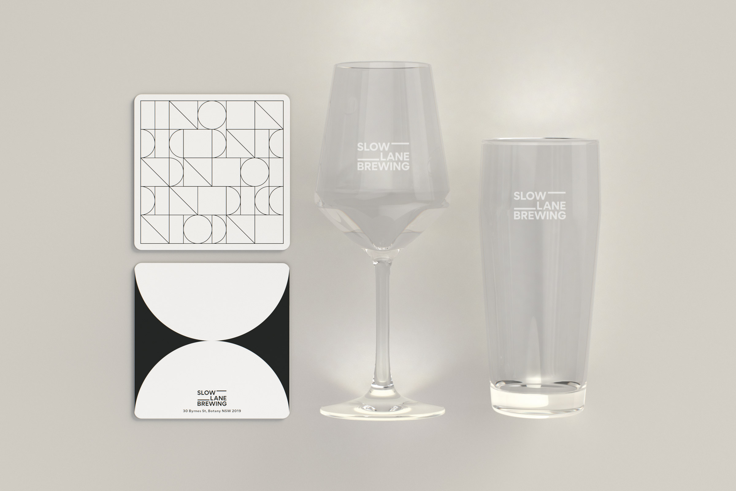
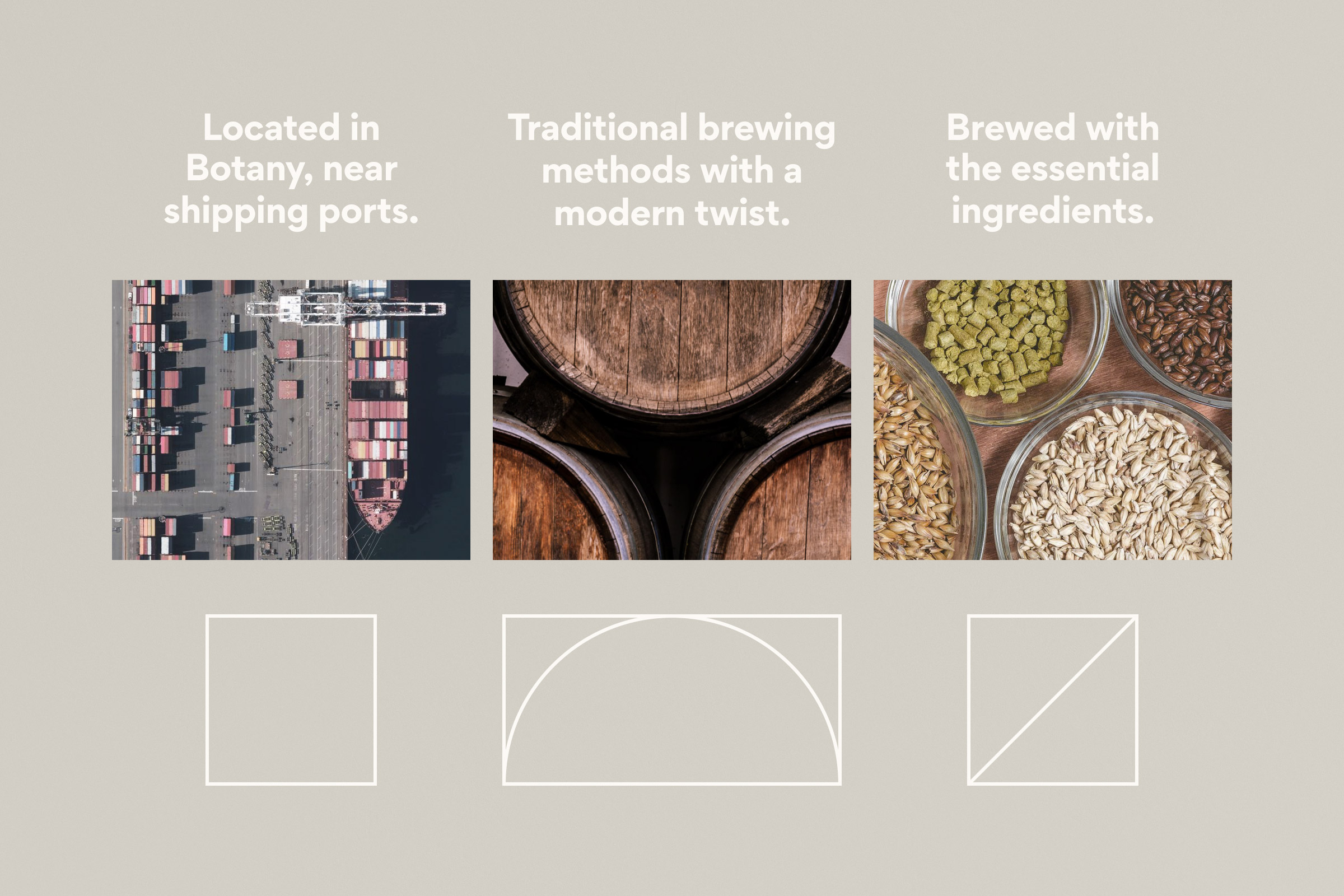
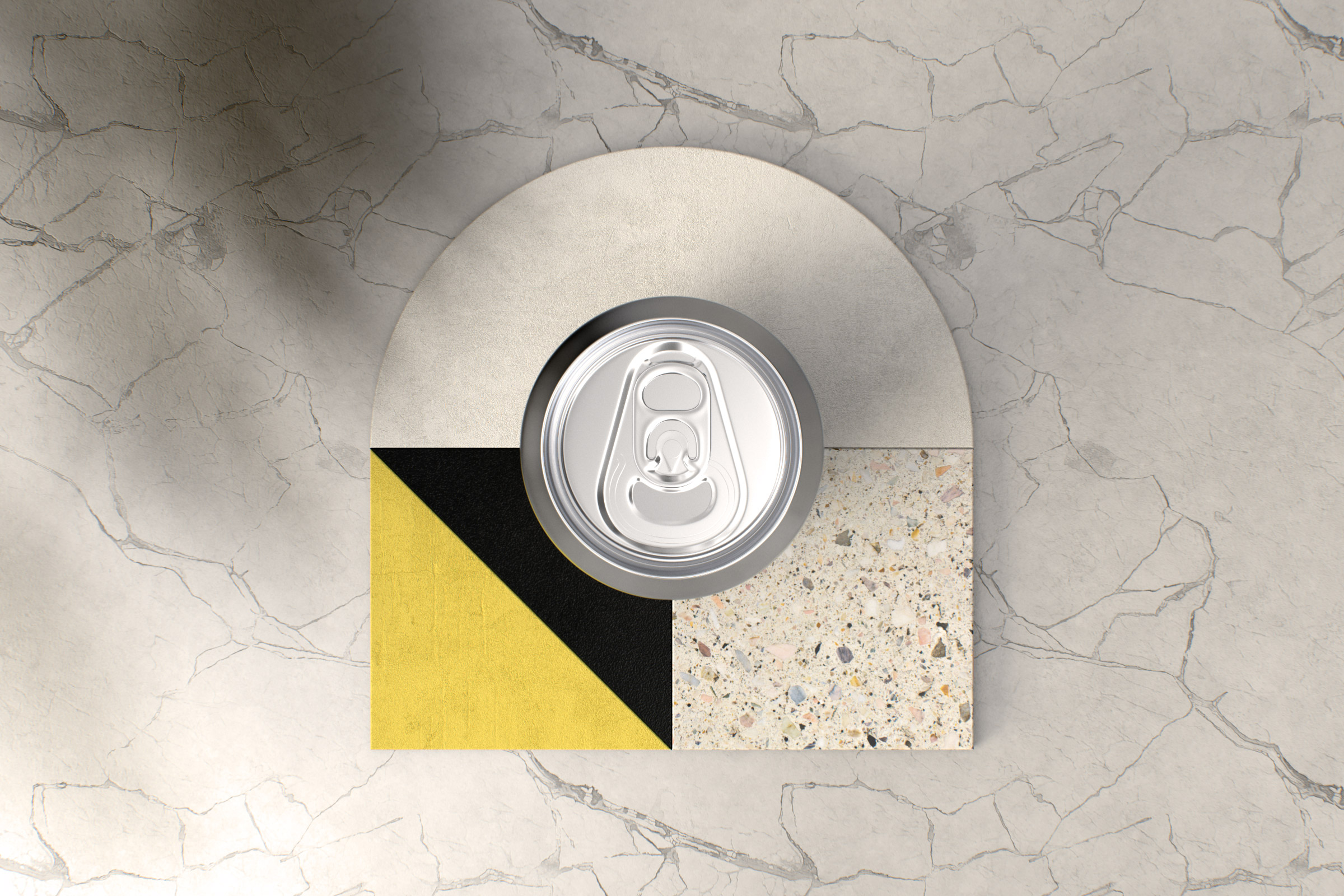
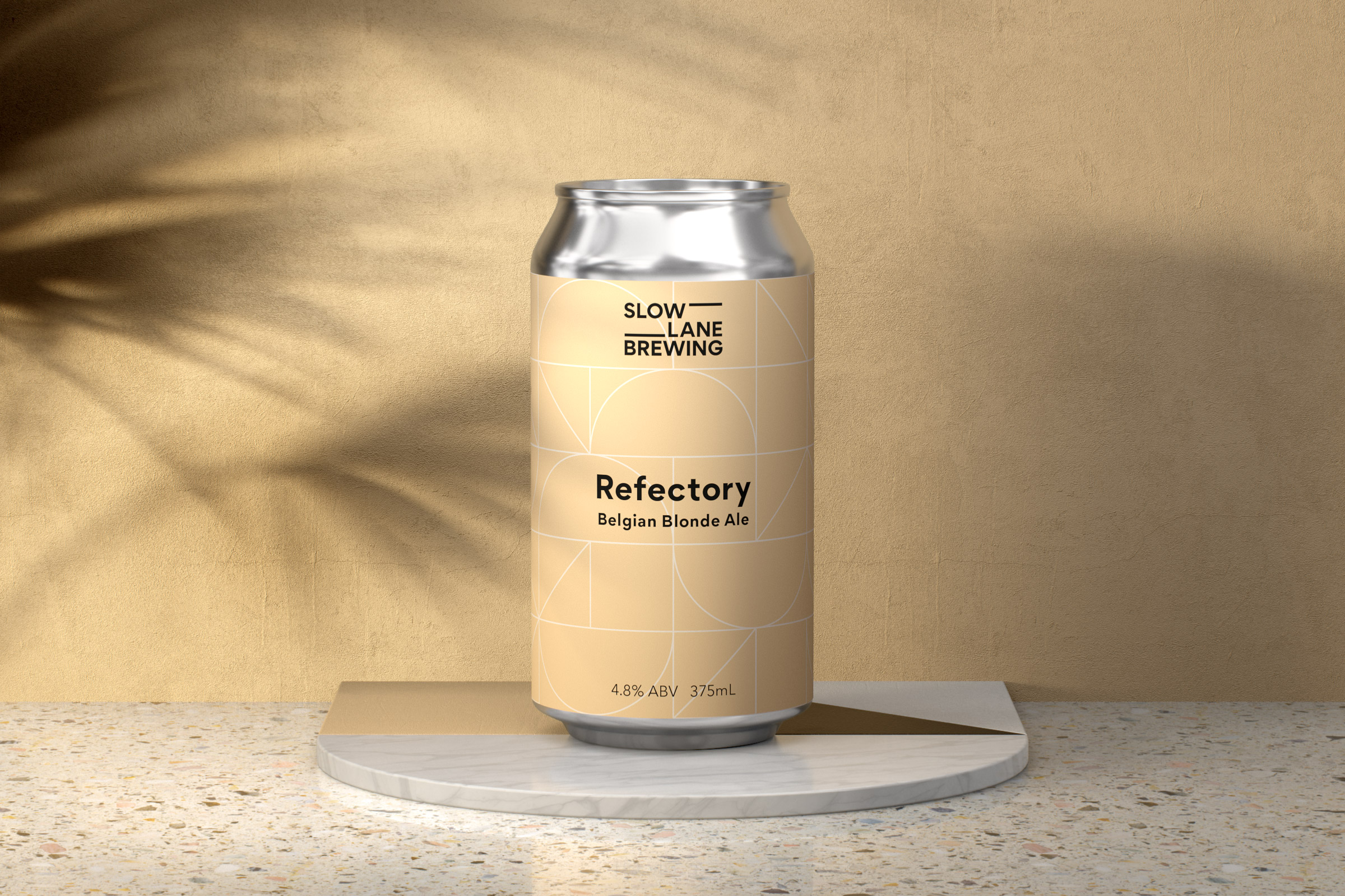
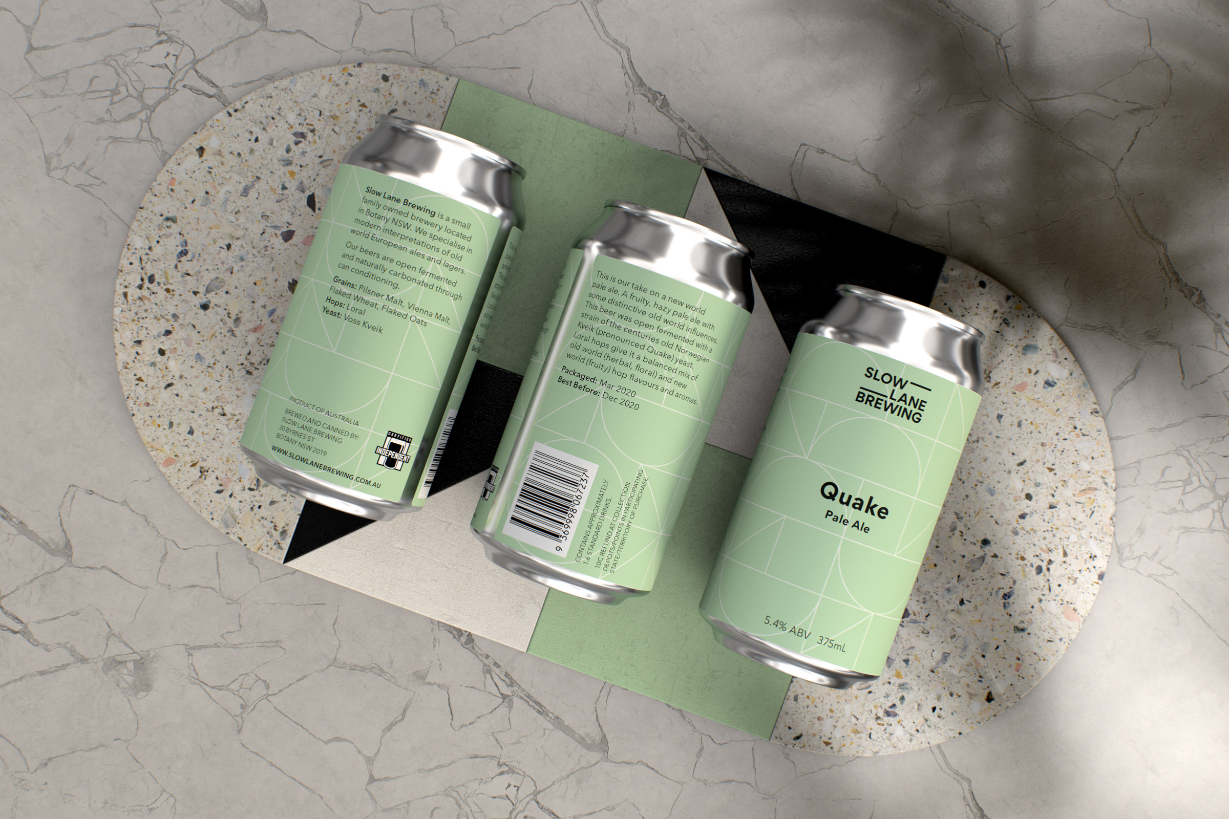
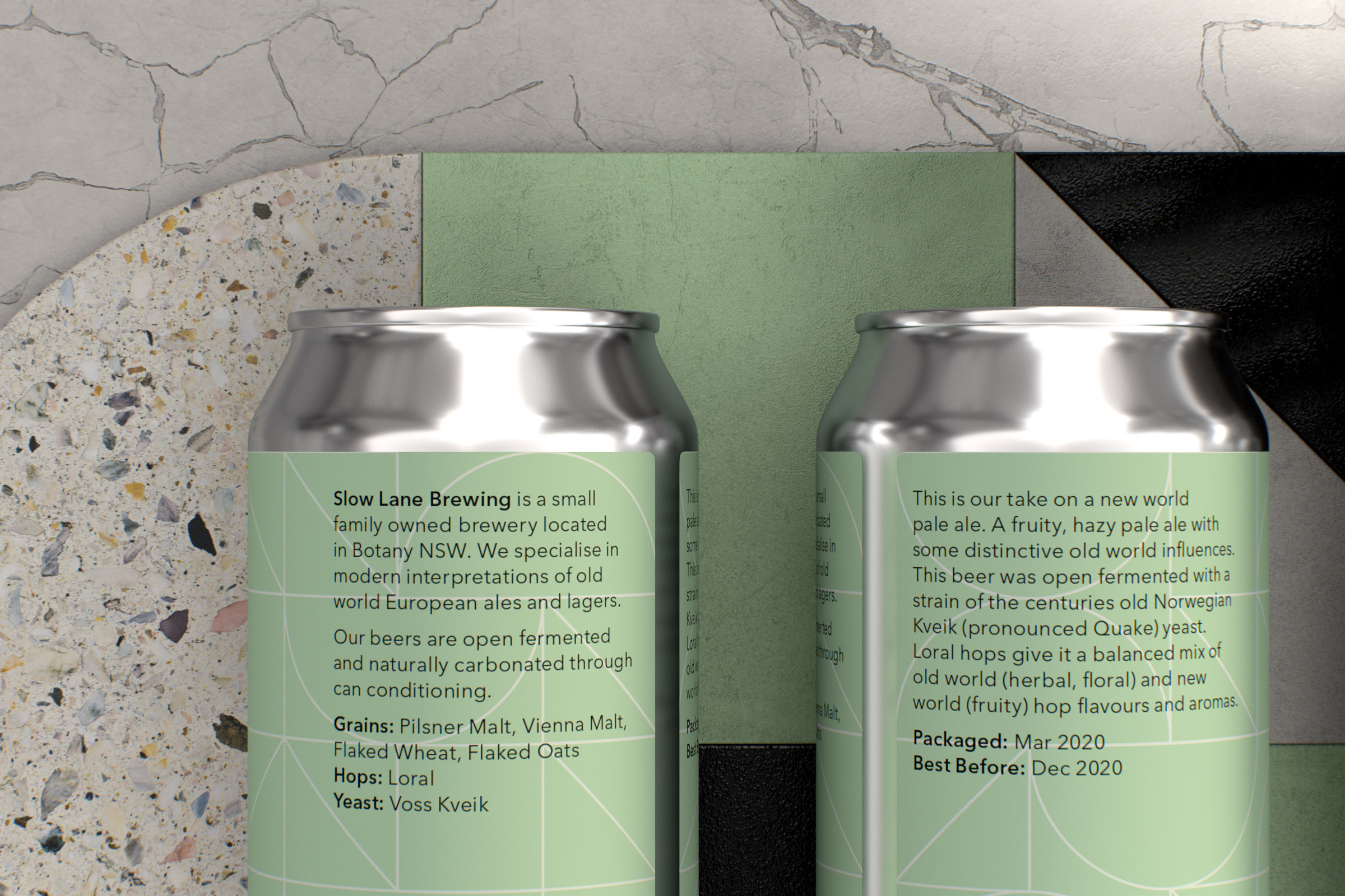
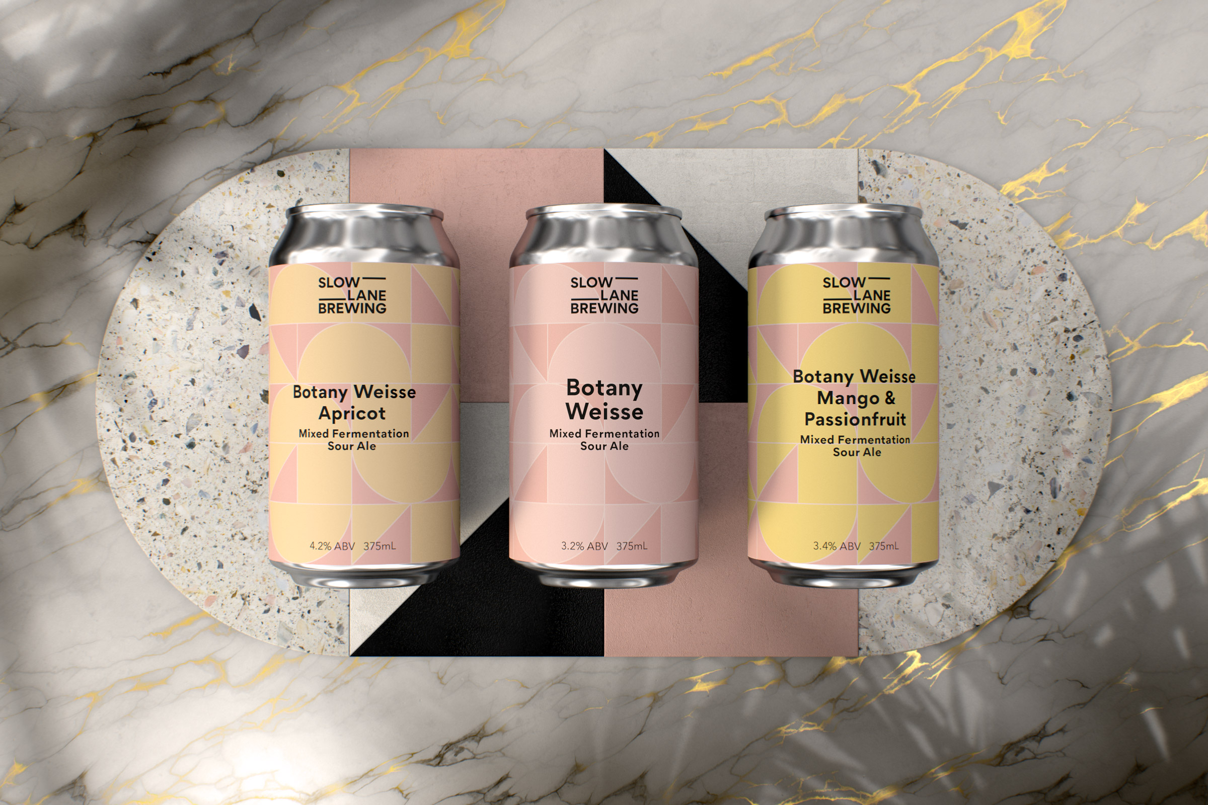
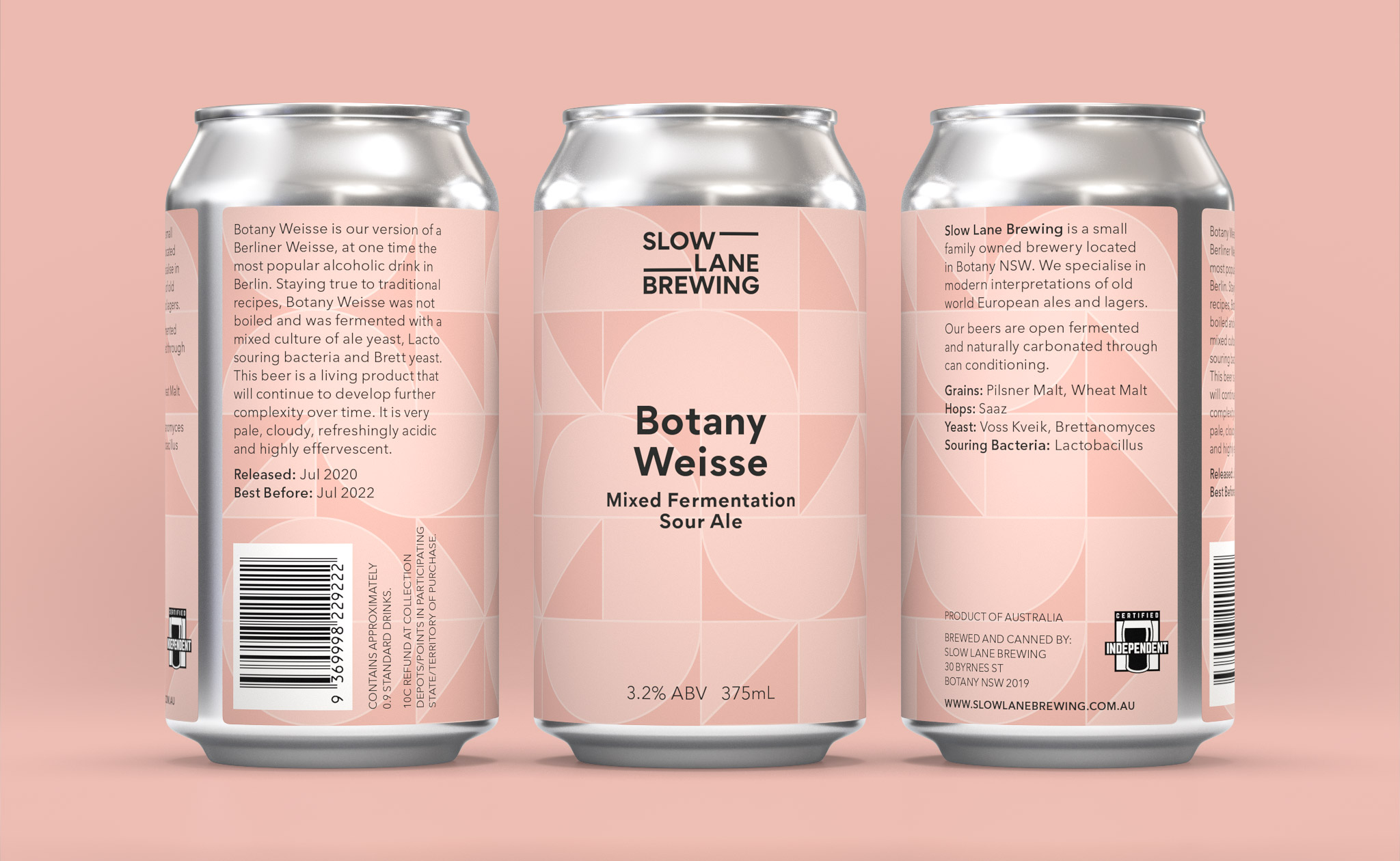
The minimal and modern system reflects the twist that Slow Lane puts on traditional brewing techniques. Inspiration is taken from Slow Lane’s location in Botany and the surrounding area. The core shapes of the brand are derived from the architecture found in satellite photography of nearby Port Botany, a large shipping port. The core shapes come together in a master brand pattern that nods to their process of only using essential ingredients, which are listed on every can.
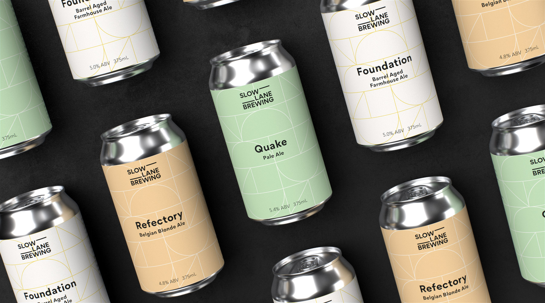
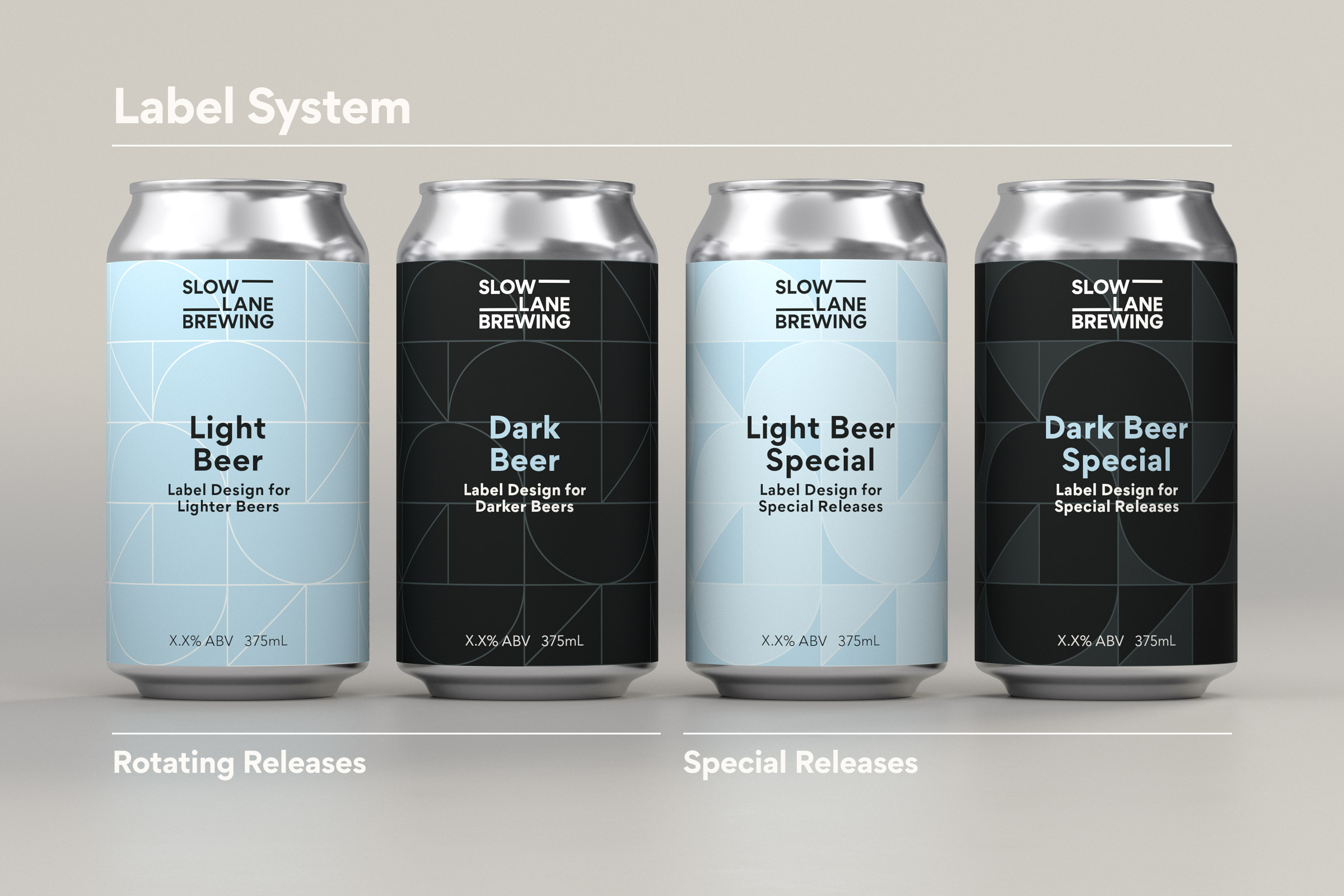
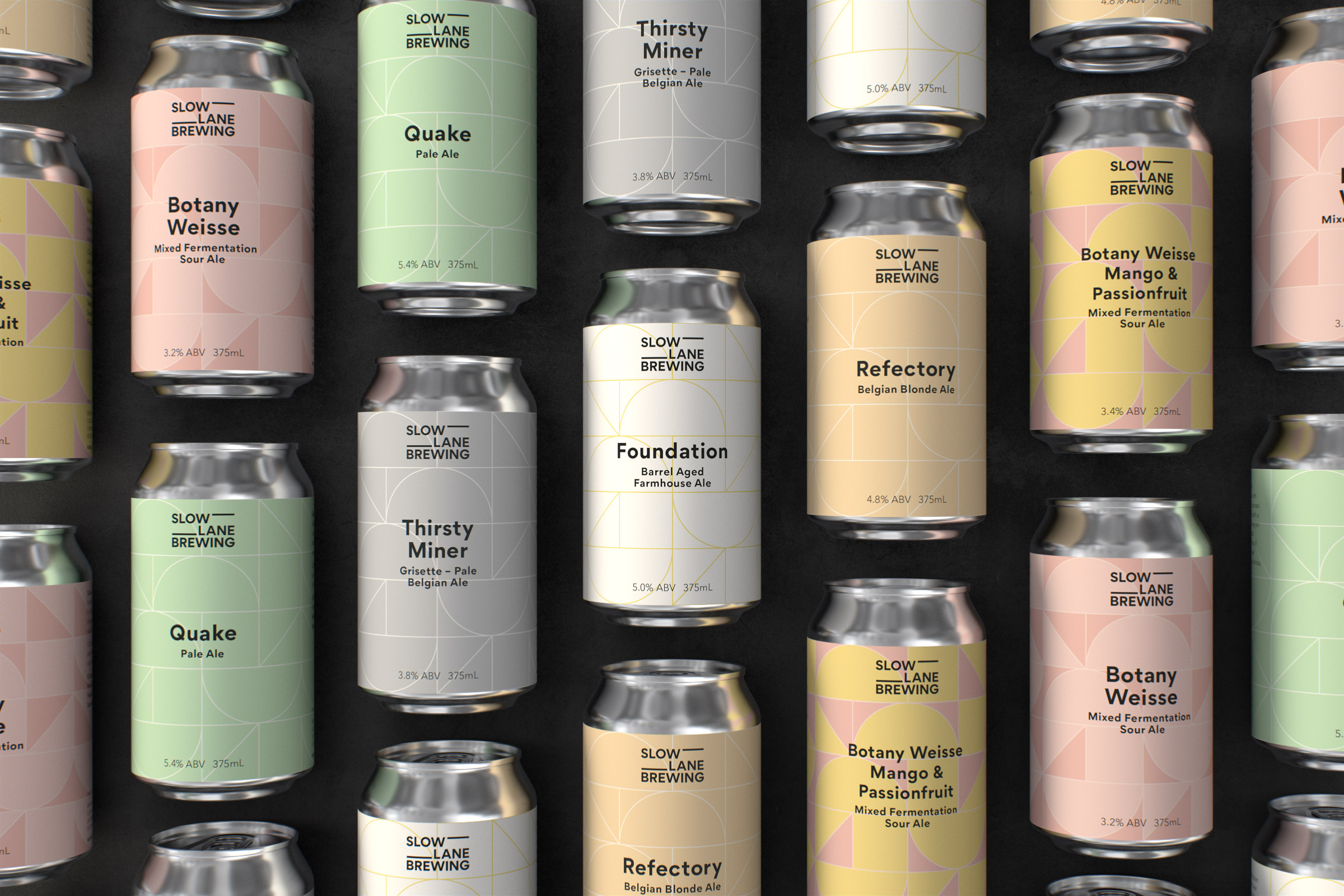
The main touch point of the brand is packaging and labels. Slow Lane has a new releases every few weeks, so the challenge was to support a constant demand of difference whilst maintaining unity. To do this clear typography, the master brand pattern and a feature colour come together as the main ingredients for every new beer. Within this recipe Slow Lane Brewing has the ability for endless variations to be used across their product range, from lighter beers all the way to darker offerings.
The main touch point of the brand is packaging and labels. Slow Lane has a new releases every few weeks, so the challenge was to support a constant demand of difference whilst maintaining unity. To do this clear typography, the master brand pattern and a feature colour come together as the main ingredients for every new beer. Within this recipe Slow Lane Brewing has the ability for endless variations to be used across their product range, from lighter beers all the way to darker offerings.


CREDITS
Creative Direction, Design & Animation: Ben Nichols
Creative Direction, Design & Animation: Ben Nichols